
During this assignment I felt curious about the potential of ChatGPT to come up with answers about which cities had the best GIS resources online, so I started by posting the following question:
¿Which cities allow the easiest access to their GIS databases?
It came up with a list that included London, Buenos Aires, Seoul, Vancouver, etc. I choose Amsterdam because of I tought it might be interested to understand their relation of water canals with green areas.
Obtaining information

Process to calculate area per neighborhood
The first action taken to merge data from the green areas to the geographic divisions was to calculate a geometry field after having re-projected the shapes obtained online to UTM zone no. 31.
After that I was able to make a spatial join into the Burteen ( neighborhood) shapefile and calculate the percentage of green area per each unit. For reasons I yet need to understand some of the fields gave back invalid geometries, they will be defined as NV. I had problems with the intervals because the were to spread, having values between .0001 and as high 75% of the total area of the neighborhood.
As for the square meters of green areas per inhabitant the process was done trough the location of census data and a table join of the name of the neighborhood since a code number was not located in the census data. It’s important to mentions that as in the case below the symbology and the way that Qgis divided the data into bins was a bit confusing.
Problem as the following:
- Case 1: The data gets divided using equal quantiles and visually it makes sense.
- Case 2: The data gets divided using its natural breaks and the classification makes sense but the visual aspect loss power and seems to bland.
In the following maps it’s important to mention that Equal Quantiles were used.

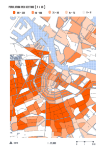
M2 of green Area per Person